Thursday 28 April 2011

My Latest


There is a drama to a light form emerging from the dark that has been known and used by artists for centuries. Leonardo Da Vinci said: "A painter should begin every canvas with a wash of black, because all things in nature are dark except where exposed by the light."

Sometimes, however, it is interesting to see what happens when a subject emerges from the light, so that the parts we see are those that are in the shade, rather than those that are lit. When that subject is itself quite light in colour, I think it makes for shapes that almost reach abstraction, and where we must work to identify the parts, even as the whole makes sense. If nothing else, it's a challenge a a lot of fun!

Friday 25 March 2011

Sophie Christiansen


Sophie riding Rivaldo of Berkeley

As the 2012 games approach, athletes are working very hard to prepare for representing their country. The time they spend in front of the judges usually only lasts a few minutes, and it is often easy to forget that their performance represents hundreds and hundreds of hours of practice. This is especially true in equestrian sports, such as dressage, where the more polished the performance the easier it can look.

I'm undertaking a portrait of paralympic dressage rider, Sophie Christiansen. Sophie has cerebral palsy, which makes coordination of her limbs and maintaining her balance a real challenge, especially in dressage. Despite the hurdles she must overcome, Sophie has won numerous championships including two gold and one silver medal at the Beijing Paralympics, and a bronze at Athens, at the tender age of 16. I want my portrait to convey the work that Sophie and her coach, Clive Milkins of South Bucks RDA, put into preparing for the 2012 games. But more than this, I plan to portray Sophie as the well rounded person she is, because she is not a professional rider and has to fit training into a very busy life that includes studying for a masters degree at University of London.

I first met Sophie when I went with her mother, Caroline, to the RDA facility in Buckinghamshire. I also met her "ride", the beautiful Oldenburg gelding Rivaldo of Berkeley (Robin). Robin is not "push button", but is a very sensitive soul, as well as being highly intelligent. I asked Clive if the horses at the RDA required special training, and he replied that they need a kind heart and willingness, which certainly seems to describe Robin.

The training session, which took place in the indoor arena, was a fascinating experience. Riding without stirrups, it became very clear just how hard Sophie had to work, juggling maintaining her balance with the physical cues needed to guide Robin. Her perseverance, as well as her absolute honesty about and merciless appraisal of her riding, gave a glimpse of the determination that has made her World Champion. Through a constant dialogue with Clive, she honed her performance over the period of training.

The following Sunday, Caroline, Sophie and I traveled to Dartford for a competition. Sophie mentioned that she was very tired, because there's a lot of work to do in your final year at university. Still, here she was on a Sunday, preparing to compete whilst other students enjoyed a morning in bed and a big breakfast.

Clive took Robin into the outdoor arena to warm him up. At this point we were treated to a display of Robin's moves, with a trot that seemed to float six inches above the ground then moving into an extended trot that was pure grace. Listening to Clive talk, afterwards, it is clear that he dearly loves horses and respects them as individuals, understanding and allowing for their character traits in the work he does with RDA.

After the warmup, we watched Sophie take Robin through his paces, then it was off for the two classes into which Sophie was entered. Watching her ride, her body still and relaxed, her horse going flawlessly through his paces, it became clear just how much determination and skill she brings to her riding. She is a lovely young woman of enormous talent and resolve, and I can only hope that I will be able to convey some small part of this in her portrait.

Friday 25 February 2011

Terminal Five Expo Gallery


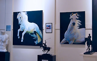
It seems obvious, once you've seen it, that a gallery of original art in an airport terminal is a good idea, especially when the work is by artists from the country where the airport is sited. My work is now on display in the Terminal Five Expo Gallery at Heathrow Airport, as part of an exhibition called "Legacy". It's a lovely space and, because it is at the quieter end of the terminal, is amazingly peaceful.

With check-in having to take place at least two hours before a flight, people have a lot of time on their hands. They are drawn into the gallery to see something they normally would not encounter at an airport. Once inside, visitors say that it is like being in an oasis where you can forget you are in a terminal.

I've met some delightful people from all walks of life in the time I've spent in the gallery. Airport staff often drop by for a chat when the terminal is quiet. Travelers seem to love to discuss all the work. There are sculptures by Susan Leyland, Lorne McKeen and Mike Speller, and paintings by Jeremy Houghton and others, as well as yours truly. The guest book speaks of how delighted and surprised passengers are with the concept, and it is a lovely experience to be involved with something that obviously brings such happiness to so many people.

Thursday 17 February 2011

Robert Bateman


When we look at a realist painting we tend to think that we are looking at the items within it — a face, a chair, a street scene, etc. But what pulls us into the painting to start with has nothing to do with detail and how well it is painted, it has to do with overall design. Take the wildlife paintings of Robert Batemen. He paints animals exquisitely, no doubt about it, and his scenes are rendered in perfect detail. What elevates him above the many other artists who are superb draughtsmen is his great design skills. His paintings are almost abstractions and come to life and engage us because of their daring arrangement of space on the canvas.


Classic Bateman sees the main object of his work set off to one side of the canvas. There is dramatic use of very low or high horizons and huge areas of white space. Animals are viewed from unexpected angles and often seem to disappear into the background, just as they would in nature, so that we must go searching for them and then enjoy the act of discovery. His paintings are first and foremost about shapes and design and because they jolt us with their daring arrangement of blocks of colour upon the canvas, we can then become aware of the detail and of the skill that lies behind it.


Wednesday 2 February 2011

Creating Harmony

Most of us are visual creatures, even if we don't realize it, and we have an innate tendency to seek out patterns in our surroundings. After all, if you were living in the savannah of Africa as our ancestors were, your survival could depend upon whether or not you recognized that all the prey animals were avoiding a particular stand of trees because a leopard had just moved in there.

We also have a tendency to be attracted to visual harmony and it can make a painting attractive to a viewer, even when there are faults in the execution. There are many factors to be considered when setting up the composition of a picture. One way to create harmony in a painting is to repeat the same lines of direction throughout a composition. If directional lines, such as the edges of objects and areas of contrast between light and dark, run parallel to one another, then it will give a far more harmonious feel than if those same lines point in many different and random directions.


In the painting shown here, most of the parallel lines of direction point from the top right to middle bottom left of the image. The line is repeated many times throughout the composition, creating a repeating pattern that gives a feeling of harminy. I have found that the slope of a line relative to the horizontal or perpendicular affects the message being sent by the composition. This is a portrait of love and contentment, so the lines are nearer to straight up and down, where a diagonal drawn from corner to corner would imply more energy.

You're not usually going to have all lines pointing in the same direction, because then there is nothing to hold the viewer's eye within the composition. To pull the viewer back into the picture, I chose lines running from top left to bottom right. They form a gentle angle to the first set of lines and do two things:

1. the angle of intersecting lines creates tension. The greatest tension is when lines are at right angles to one another. In this painting the lines intersect at a wide angle, giving the feeling of harmony.
2. the intersection of some of the lines create cups in which important features of the painting can rest. In this case it is the chin of the woman and then her elbow, which is not present in the picture but would be a natural projection of the two lines following the outside of her arm.

Friday 21 January 2011

The Victorian Artists

"The Music Lesson" by Lord Leighton

I've always loved the paintings of the Victorian artists. For many years people turned their backs on works by artists such as John Everett Millais, William Holman Hunt, John William Waterhouse, Lord Leighton and Lawrence Alma-Tadema, rejecting them as cheesy and overworked.

"The Pot Of Basil" by Holman Hunt


Yet these and other realist artists working in the 19th century reached amazing heights of artistic representation in their work. Never had the human form looked so real and natural as it did in their work. They reintroduced dazzling colour and beautifully observed nature into their paintings, even as photography appeared to kill off the genre.


I've recently been introduced to another artist of the period whose work I have now added to my stable of favourites. His name is William-Adolphe Bouguereau and, unlike the other artists I mentioned, he worked in France to produce paintings on classical themes. Many of his pieces are of nude women and exquisitely painted observations of the human form.

"After The Bath" by Bouguereau

Classical realist painting fell from grace as the impressionists gained popularity. Yet they have so much to teach us about composition, the use of colour and of draughtsmanship, as well as classical beauty.

Saturday 15 January 2011

Pulling it together


The first in the series was "Morning Inspection". I wanted to convey how many people were involved in preparing for the soldiers to leave for duty at Horseguards — that was my narrative. The major decision when starting any painting, however, is the composition and this has nothing to do with the cast of characters chosen for the work. The layout is crucial, and this is based upon shapes and their distribution on the canvas. I knew that I wanted the captain to be my central point, but there needed to be a dynamic around him or the piece would become too static. I thus decided on a composition based around two interlocking triangles, one large and one smaller, with an offset curve to hold them together at the top (the archway).

Since all the subjects in the painting are vertical, it became important to use other lines to stop the eyes from sliding of the top and bottom of the painting. I tried to do this by creating repeating diagonals throughout the image that form a zigzag leading from one subject to another, leading the eyes around and not out of the painting. These diagonals, such as the red arm on the right leading visually to the arm in the centre then onto the rider and down to the khaki uniform on the left, also serve to bracket the faces which are the important parts of the piece.

Colour distribution also plays an important role in a painting, especially where there are highly differentiated blocks.   Red is a dynamic colour, so I ensured that it created dynamic right angles in the painting to indicate tension and give movement whilst carrying the eye from left to right. The white areas are then designed to carry the eye in the opposite direction.

Lastly, I wanted to pull the viewer into the painting and this means setting up a dialogue where the subject "talks" to the viewer. I had two characters who were in profile, creating a wall to the viewer and one whose face is partially obscured. To compensate, they are balanced by the same number of objects interacting directly with the viewer — the soldier on the left, the horse, and the soldier in blue on the right. The interacting and non-interacting objects form an alternating pattern, to keep the viewer engaged with the characters in the painting even if they aren't attracted to the subject matter or the style of painting.

It might not be immediately apparent, but the dynamics of composition apply just as much if not more to a painting of a single subject. The first decision about the painting must always be one of how shapes arrange themselves on the canvas. There are time honoured principles that can be used to help decide the correct balance of shapes in a painting and Juliette Aristides http://www.aristidesarts.com/ book, "Classical Painting Atelier" gives a really great insight into how these work in a contemporary context.

Friday 7 January 2011

Choices, so many choices

Photographers and realist painters are both involved in the process of making art about recognizable subjects. A good photographer will compose their shots, just as any good painter will compose a piece of art. Both disciplines require experience and hard work in order to translate the image in ones head into the work before our eyes. Both must make choices about what to leave in, what to take out, how to crop and balance an image.

In many ways the painter has the easier job because, unless a photographer has complete control over the environment they are shooting, there will always be extraneous pieces of imagery that will be included in the shoot especially when  out of doors. The photographer must be able to see the potential whilst taking in all that noise that could change the focus of the shot.

The painter, on the other hand, can pick and choose what to leave in and take out of a piece. They can change their mind and paint objects in and out of their work. The trick then becomes combining objects in a way that is harmonious and doesn't make a piece look like a collage. They have to lose the noise and keep the essentials and that doesn't just mean what objects are included in the final piece, because the painter makes constant choices about colour, direction of brushstrokes, emphasis, etc. as they paint.

I took thousands of photos of the Household Cavalry on my visit to Hyde Park Barracks. They were essential references for the paintings I created. The works themselves, however, are not copies of those shots. Once again, the snapshots were jumping off points for the paintings, which are based on a series of impressions, rather than a specific event.